Rappelz, The Rift : The User Interface
This post is also available in Français
A user interface’s optimization is the key to any successful mobile game, it should be neat and match the screen’s size. Today, we’ll see that Rappelz : The rift is no exception.
Here is the third article of our dedicated Rappelz, The rift series : The user interface.
After having accessed Rappelz, The rift’s CBT (Closed Beta Test), we had some doubts concerning the game’s compatibility and manageability on mobile phones. Fortunately for us, Gala did a great job, proposing a simple and modern interface.
With no further due, here is a screenshot presenting the interface’s different aspects during a party raid.
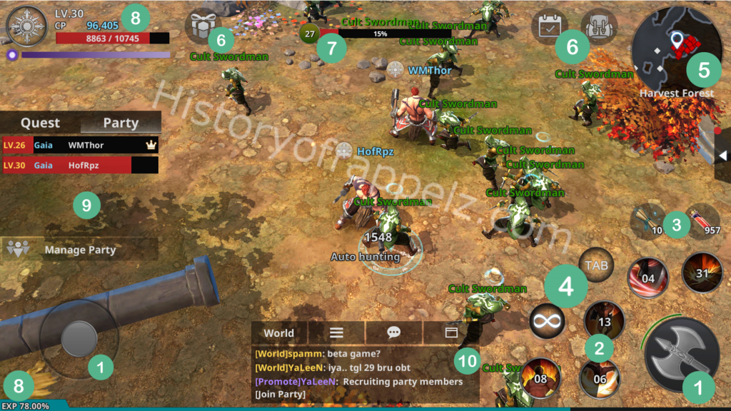
Simple and efficient !
To clarify, here are some details about every element and it’s corresponding number on the picture above.
- The two biggest buttons on the screen, corresponding respectively from left to right :
- The joystick, for “manually” moving your character.
- The attack button. When the auto-attack option is de-activated (check point no.4), you’ll need to spam this button to attack your enemies.
- Skills and cooldown. On the CBT, we can count five skills, with more or less high cooldowns. Of course, each skill has its properties and utility depending on the enemy.
- The available consumables (here, tp scrolls and vitality potions)
- The Auto-attack and TAB buttons. These two buttons enable your character to attack automatically and to switch targets. Here, auto-attack is activated.
- The mini map. Enemies, quest objectives and your character’s location are shown on the map.
- Reward, Daily Quest and Inventory buttons.
- The targeted enemy information bar. The level and HP of your target are shown here.
- Your character’s information bar. It indicates your level, race, CP, HP and MP. Under it, you can find your character’s EXP bar indicating the obtained experience in percentage, 100% corresponding to a complete level.
- Quest and party interface. You can check your active quests and you party members, their race, level and HP.
- The chat box. Here you can check the world chat. You can also access group chat and private messages, the chat can be customized.
Of course, there is more to it !
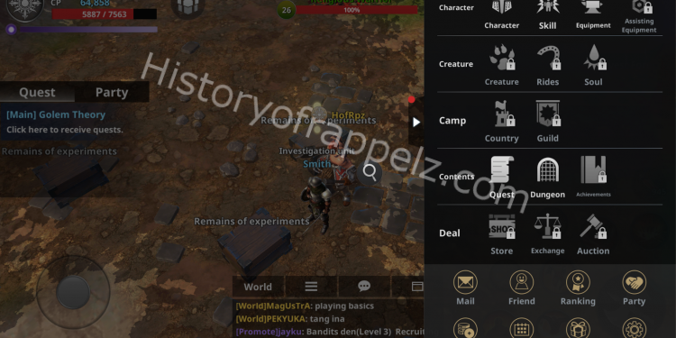
You may have noticed the white arrow to the right on the previous screenshot. Clicking on it will let you access many more menus !
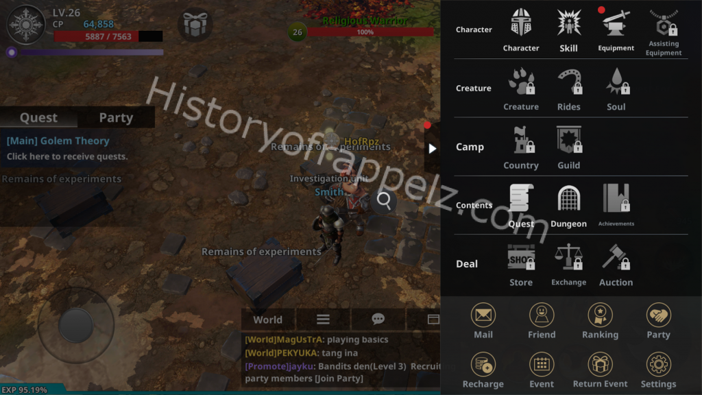
The game’s principal menu
This menu is divided in six major parts.
- Character : Your character’s menu. Here, you have the possibility to enhance your skills and gear. More information regarding this menu in the end-of-article video !
- Creature : The creature’s menu. Sadly, it was not accessible during the CBT.
- Camp : Guilds and cities management. Also not accessible during the CBT.
- Contents : A menu containing information on quests, dungeons and trophies. (Trophies were not included in the CBT)
- Deal : Or the “Business Corner”. Where you can find the cash shop, auction house and trade buttons. However this menu was not active during the CBT.
- Finally, the “General” menu, where you can find your inbox, friend list, general ranking, parties, a recharge button (maybe for buying Cash shop currency), current events, “Return” events (no information at the moment) and the game’s general settings.
The game’s interface is well organized, keeping the gaming experience enjoyable and optimal !
You’ll find some of these menu more thoroughly explained in Wantmytip‘s video below, with the usual English subtitles by Twist 🙂
See you soon !
